Background
As a leader in the wellness industry for over 40 years, Canyon Ranch offers their guests transformative experiences integrating health and well-being at its immersive destination resorts. In order to support its future growth and expansion vision, Canyon Ranch needed to optimize an inefficient and often overwhelming guest planning experience.
Partnership
Canyon Ranch partnered with our team to reduce scheduling and communication complexity for an elevated guest experience that reduces costs and increases revenue while maintaining the brand’s core belief in human connection. I was responsible for working with engineering, operations and research as well as product owners and executives to provide creative direction, product strategy and design management.
Uncovering the Unknown
A robust and agile discovery surfaced critical guest and backstage pain points and opportunities. We mapped these challenges against business objectives and technical constraints to develop a strategic product vision that delivers maximum customer and business value.
Methodologies
Hypothesis Generation and Stakeholder Workshopping
User Interviews
Service Blueprint
Wireframing
Low & High Fidelity Prototyping
Usability Testing
Setting the Foundation
Canyon Ranch’s vital resource, the Wellness Guide, was spending an inordinate amount of time on low-value activities, such as scheduling. With the development of a customer-facing mobile app and integration with their existing reservation system, Book4Time, our team could lay the foundation for optimizing operations as well as easing guest’s scheduling pain points.
User Personas + Flow
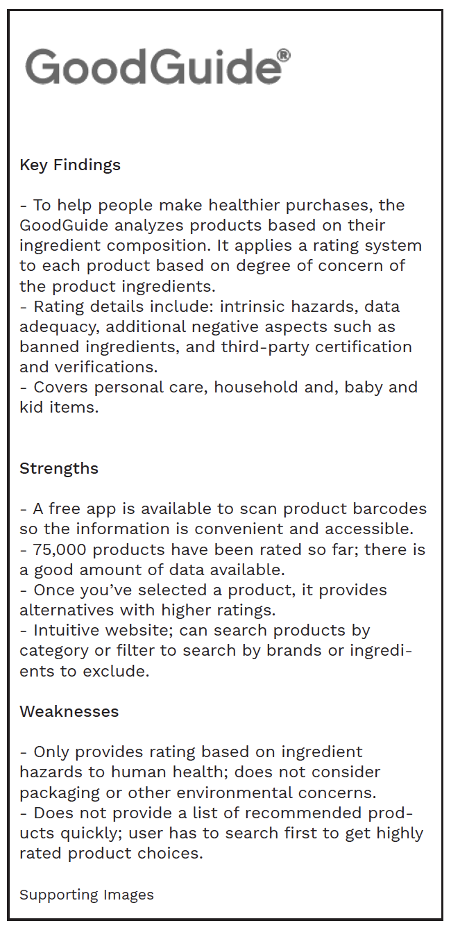
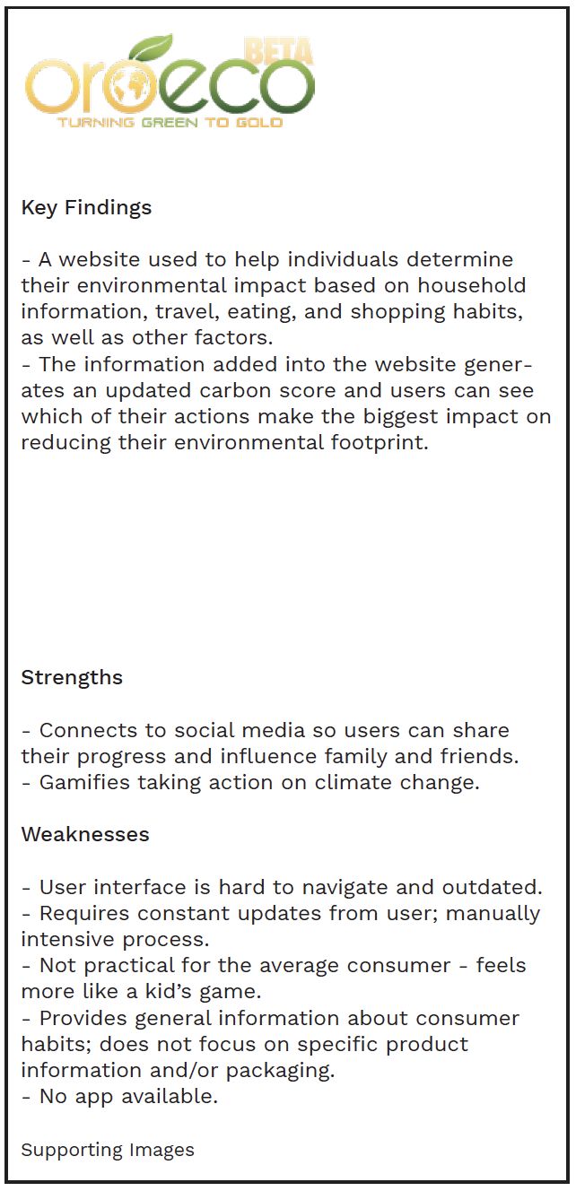
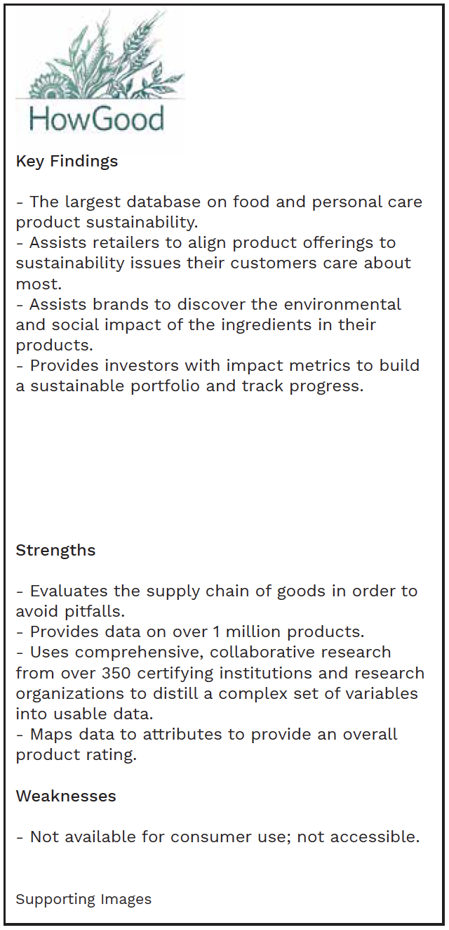
After taking a look at what products are currently available, I began building user personas from both quantitative and qualitative data in order to humanize my target audience. From there, I constructed user flows that reflected the main objectives of my personas. One such flow, stemming from the goals of my main persona, is mapped here:
Feature Prioritization
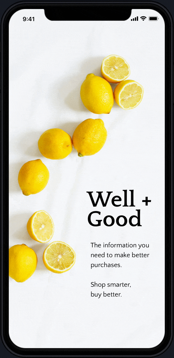
As the scope of the product grew so did the request for features. Working with a limited timeline to design the interface, I chose to prioritize my desired features by level of effort/expense and priority. With a background in web development, I was uniquely positioned to understand the heavy lift that would be required by some of the more complex features which would require an API integration with a third-party database. This helped me determine a baseline of offerings for the MVP rollout of Well + Good.
Virtual Card Sorting
Due to the pandemic, multiple, virtual, open card sorts were then conducted to aid in intuitively organizing the products of the app.
Card Sort #1

Card Sort #2

Card Sort #3 (Final)
Prototyping + Usability Testing
After multiple iterations of wireframing and sketching, a visual design direction was established and high fidelity prototypes were developed. Usability tests were conducted to find gaps in the design and the prototypes were modified to address these initial shortcomings.
Click on the tooltips on the images to see some of the changes that were made along the way.
The rating system was found to be confusing for new users. Adding “out of 100” underneath the score helped provide context.
Initially, this element only used an icon to symbolize more info. It became apparent during testing that it wasn’t immediately clear to all users what the icon represented. “Ratings Breakdown” was added for clarity.

This ‘Understanding Our Ratings’ page wasn’t added until after usability tests were performed; it was determined more context was needed around the rating system. A link to this page can be found under the ratings breakdown of each product.